Nick Desbarats
nickdesb.bsky.social
Nick Desbarats
@nickdesb.bsky.social
Independent instructor and best-selling author, data visualization and dashboard design.
Books, videos, articles, training workshops to level up your dataviz or dashboard design chops: www.practicalreporting.com
Someone else proposed this use case but, to my eye anyway, bars would be considerably quicker and easier to read:
August 28, 2025 at 10:09 PM
Really excellent. Nice work, @shrikhalpada.dev .
July 11, 2025 at 3:05 PM
While I (thank god) haven't had to do a lot of hands-on work w Power BI, I've seen enough to know that it would be soul-destroying for anyone who cares about making effective charts.
I'm sometimes asked to adapt my courses to Power BI's limitations; my answer: www.linkedin.com/pulse/why-wo...
Why it wouldn’t make sense to adapt Practical Charts to Power BI’s limited visuals
My Practical Charts course is tool agnostic, that is, it doesn’t assume that any particular dataviz software product (Excel, Tableau, Google Sheets, etc.) is being used.
www.linkedin.com
July 8, 2025 at 4:25 PM
So, all dashboards should be ignored?
July 8, 2025 at 4:09 PM
Nice. I have yet to find a good use case for radar graphs, apart from some highly specialized applications in which the audience thinks of the data as "circular," e.g., wind roses.
May 26, 2025 at 7:11 PM
Agreed. I cover this situation in my "Practical Charts" course and book:
May 17, 2025 at 4:12 AM
The dumbbell version would address the "steep slopes" perception issue, but it adds visual busy-ness and I'm not sure it makes the deviations between both series any more salient. The line chart also communicates that one series was always lower than the other at a glance...
May 13, 2025 at 4:34 PM
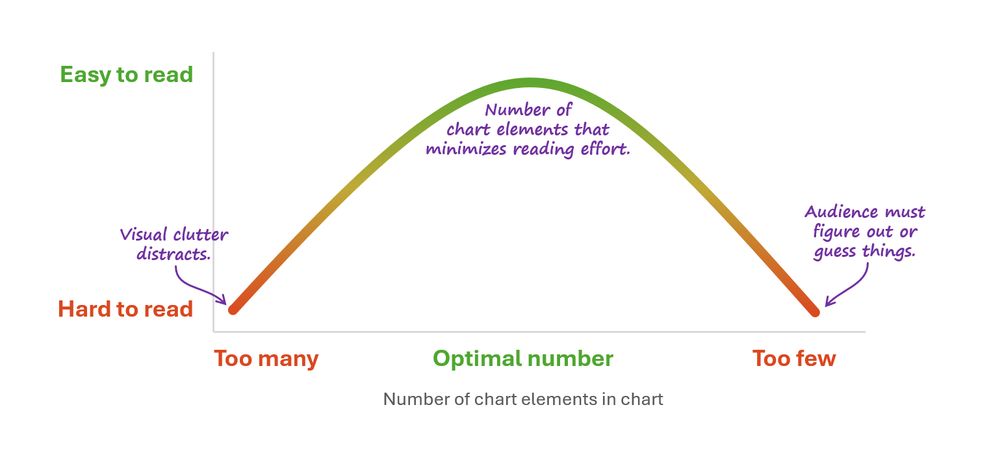
Love this.
(...though the minimalism-fascism connection feels like a bit of stretch, IMHO.)
May 13, 2025 at 2:32 PM
@duvekot.bsky.social I see your point but, again, pros and cons. If you only show deviation vals, the scale of the "lag" is lost. In a chart like that, it could be that, e.g., in the grand scheme of things, Boeing is only lagging Airbus by a tiny amount relative to total sales, or it could be huge.
May 12, 2025 at 11:24 AM
@duvekot.bsky.social Also a viable option, yes. No color associations needed, but the trade-off is that the chart is visually busier with each category name listed four times (and yet busier with all 20 quantitative values labeled instead of a quant scale with 4 or 5 value labels). Pros and cons...
May 1, 2025 at 8:18 PM
@mjskay.com @frank.computer
🤣 Here's my version:
April 24, 2025 at 2:40 PM