


Jack West, MD, FASCO
@jackwestmd.bsky.social
Thoracic oncologist, VP of Clin Development at Summit Therapeutics, Fmr author & editor @UpToDate, founder of @cancerGRACE, interests in #DataViz & telemedicine. COI at JackWestMD.com
It may take some getting used to, but I think it would be clear & distill to just what a clinician (or pt) would care about. An alternative could be to just have bar graphs show same info. Do folks like this kind of called out subset of AEs? Is one format easier (both showing same data)?

January 9, 2025 at 8:25 PM
It may take some getting used to, but I think it would be clear & distill to just what a clinician (or pt) would care about. An alternative could be to just have bar graphs show same info. Do folks like this kind of called out subset of AEs? Is one format easier (both showing same data)?
IMO, it would be helpful if safety profiles for phase 3 trials highlighted where there are significant differences between 2 arms (along w/full data of all AEs elsewhere). What do ppl think of a version like this, showing a lower number for one arm & colored arrow to higher number in the other arm?

January 9, 2025 at 8:25 PM
IMO, it would be helpful if safety profiles for phase 3 trials highlighted where there are significant differences between 2 arms (along w/full data of all AEs elsewhere). What do ppl think of a version like this, showing a lower number for one arm & colored arrow to higher number in the other arm?
Following the same principle, some swimmer plots feature not just duration of treatment but enhancements like details of a patient’s past treatments, off-protocol therapies, molecular features, response milestones, & of course markers for ongoing treatment on trial. (3/5)

December 19, 2024 at 3:09 PM
Following the same principle, some swimmer plots feature not just duration of treatment but enhancements like details of a patient’s past treatments, off-protocol therapies, molecular features, response milestones, & of course markers for ongoing treatment on trial. (3/5)
Some investigators enhance waterfall or swimmer plots in ways that add layers to the core image. For instance, here’s a waterfall plot that adds details of patient mutational & protein expression results, mut’n location, & prior Rx (here, before trastuzumab deruxtecan). (2/5)

December 19, 2024 at 3:09 PM
Some investigators enhance waterfall or swimmer plots in ways that add layers to the core image. For instance, here’s a waterfall plot that adds details of patient mutational & protein expression results, mut’n location, & prior Rx (here, before trastuzumab deruxtecan). (2/5)
Plussing our figures
In oncology, figs like Kaplan-Meier curves, waterfall plots, & swimmer plots are central to how we interpret data. A stated HR or diff in med surv is compelling, but visual impact of a figure can make us feel it viscerally (here, CROWN trial 5-yr EFS). (1/5)
In oncology, figs like Kaplan-Meier curves, waterfall plots, & swimmer plots are central to how we interpret data. A stated HR or diff in med surv is compelling, but visual impact of a figure can make us feel it viscerally (here, CROWN trial 5-yr EFS). (1/5)

December 19, 2024 at 3:09 PM
Plussing our figures
In oncology, figs like Kaplan-Meier curves, waterfall plots, & swimmer plots are central to how we interpret data. A stated HR or diff in med surv is compelling, but visual impact of a figure can make us feel it viscerally (here, CROWN trial 5-yr EFS). (1/5)
In oncology, figs like Kaplan-Meier curves, waterfall plots, & swimmer plots are central to how we interpret data. A stated HR or diff in med surv is compelling, but visual impact of a figure can make us feel it viscerally (here, CROWN trial 5-yr EFS). (1/5)
A hard habit to break, but it's fixable. First, I try to favor leaving key words/phrases on slides, maybe a telegraphic version of my points to remind me but leave me to speak spontaneously & authentically rather than just read full sentences off the slide. (revision of my prior slide here) (4/8)

December 16, 2024 at 5:51 PM
A hard habit to break, but it's fixable. First, I try to favor leaving key words/phrases on slides, maybe a telegraphic version of my points to remind me but leave me to speak spontaneously & authentically rather than just read full sentences off the slide. (revision of my prior slide here) (4/8)
Our slides should not be a teleprompter.
Among most common problems of slide presentations is a slide full of text (example of mine here). Why? When we see sentences of text, it’s hard for us to avoid temptation to read it verbatim, & audience reads faster than we speak. (1/8)
Among most common problems of slide presentations is a slide full of text (example of mine here). Why? When we see sentences of text, it’s hard for us to avoid temptation to read it verbatim, & audience reads faster than we speak. (1/8)

December 16, 2024 at 5:51 PM
Our slides should not be a teleprompter.
Among most common problems of slide presentations is a slide full of text (example of mine here). Why? When we see sentences of text, it’s hard for us to avoid temptation to read it verbatim, & audience reads faster than we speak. (1/8)
Among most common problems of slide presentations is a slide full of text (example of mine here). Why? When we see sentences of text, it’s hard for us to avoid temptation to read it verbatim, & audience reads faster than we speak. (1/8)
“Sorry for this busy slide…”
We should discuss a common error that many of us, myself included, tend to commit. Too often we see slides contain MANY figures of different types: it’s bewildering.
The speaker may apologize, but why make slides we feel compelled to apologize for? (1/6)
We should discuss a common error that many of us, myself included, tend to commit. Too often we see slides contain MANY figures of different types: it’s bewildering.
The speaker may apologize, but why make slides we feel compelled to apologize for? (1/6)

December 12, 2024 at 9:57 PM
“Sorry for this busy slide…”
We should discuss a common error that many of us, myself included, tend to commit. Too often we see slides contain MANY figures of different types: it’s bewildering.
The speaker may apologize, but why make slides we feel compelled to apologize for? (1/6)
We should discuss a common error that many of us, myself included, tend to commit. Too often we see slides contain MANY figures of different types: it’s bewildering.
The speaker may apologize, but why make slides we feel compelled to apologize for? (1/6)
In Praise of Sankey Charts
Lest it seem like I'm just going to criticize people's figures & slides, I want to take a moment to salute a beautifully clear, helpful figure called a Sankey chart. It's tailor-made for showing how resources (here, pts) get distributed over time/treatment.
(1 of 2)
Lest it seem like I'm just going to criticize people's figures & slides, I want to take a moment to salute a beautifully clear, helpful figure called a Sankey chart. It's tailor-made for showing how resources (here, pts) get distributed over time/treatment.
(1 of 2)

December 10, 2024 at 12:35 AM
In Praise of Sankey Charts
Lest it seem like I'm just going to criticize people's figures & slides, I want to take a moment to salute a beautifully clear, helpful figure called a Sankey chart. It's tailor-made for showing how resources (here, pts) get distributed over time/treatment.
(1 of 2)
Lest it seem like I'm just going to criticize people's figures & slides, I want to take a moment to salute a beautifully clear, helpful figure called a Sankey chart. It's tailor-made for showing how resources (here, pts) get distributed over time/treatment.
(1 of 2)
And if we wanted to visualize pt baseline characteristics alternatively as a figure that is visually quickly accessible, unlike a table, a clustered column plot can show same data, allowing quick assessment of how similar groups are, for live presentation. (7/8)
Thoughts?
Thoughts?

December 4, 2024 at 11:14 PM
And if we wanted to visualize pt baseline characteristics alternatively as a figure that is visually quickly accessible, unlike a table, a clustered column plot can show same data, allowing quick assessment of how similar groups are, for live presentation. (7/8)
Thoughts?
Thoughts?
What I also think would be extremely valuable is a version that pares down to just highlight AEs for which there is a marked difference (eg, >=10% in any grade &/or >=5% in grade >3 AEs).
This is what I’d want as a distilled message, probably alongside full AE list.
Thoughts? (6/8)
This is what I’d want as a distilled message, probably alongside full AE list.
Thoughts? (6/8)
December 4, 2024 at 11:14 PM
What I also think would be extremely valuable is a version that pares down to just highlight AEs for which there is a marked difference (eg, >=10% in any grade &/or >=5% in grade >3 AEs).
This is what I’d want as a distilled message, probably alongside full AE list.
Thoughts? (6/8)
This is what I’d want as a distilled message, probably alongside full AE list.
Thoughts? (6/8)
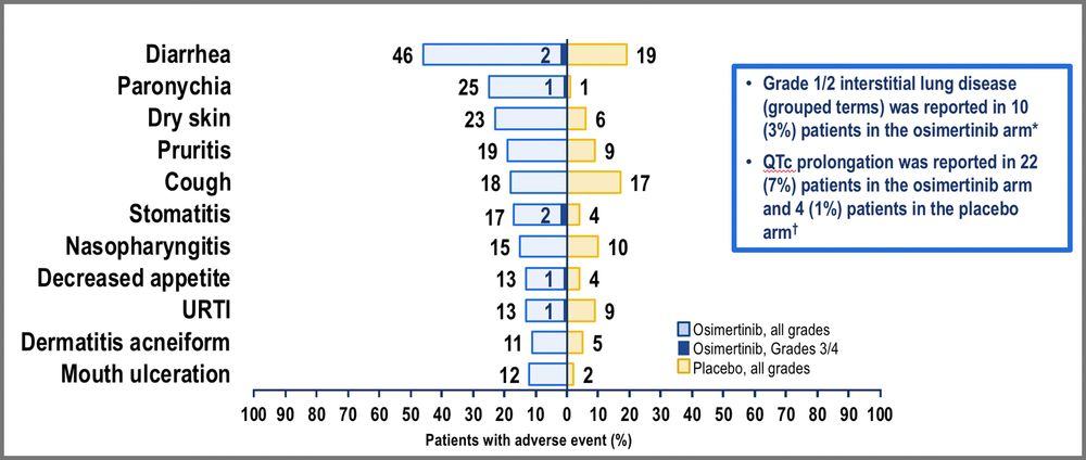
I think a tweak to show the bars next to each other, in the same direction rather than in opposite directions would make it far easier to compare diffs between results from groups.
Isn't the version on the R easier to show where diffs in AEs exist?
IMO, we should do this variant instead. (5/8)
Isn't the version on the R easier to show where diffs in AEs exist?
IMO, we should do this variant instead. (5/8)

December 4, 2024 at 11:14 PM
I think a tweak to show the bars next to each other, in the same direction rather than in opposite directions would make it far easier to compare diffs between results from groups.
Isn't the version on the R easier to show where diffs in AEs exist?
IMO, we should do this variant instead. (5/8)
Isn't the version on the R easier to show where diffs in AEs exist?
IMO, we should do this variant instead. (5/8)
A "tornado plot" provide a graphic for AEs & are widely used. IMO, they do a better job of showing data in an accessible way for quick review in a live talk.
The problem, IMO, is that you can't capture numbers in one field of vision; your eyes need to bounce from L to R to compare numbers. (4/8)
The problem, IMO, is that you can't capture numbers in one field of vision; your eyes need to bounce from L to R to compare numbers. (4/8)

December 4, 2024 at 11:14 PM
A "tornado plot" provide a graphic for AEs & are widely used. IMO, they do a better job of showing data in an accessible way for quick review in a live talk.
The problem, IMO, is that you can't capture numbers in one field of vision; your eyes need to bounce from L to R to compare numbers. (4/8)
The problem, IMO, is that you can't capture numbers in one field of vision; your eyes need to bounce from L to R to compare numbers. (4/8)
You can try to mitigate this by highlighting a row or cell, whether by adding visual features like an arrow, outline, highlight, etc., & speak to it to convey a message in a live talk, but this is still just circumventing problems of a big table in a live presentation. (3/8)

December 4, 2024 at 11:14 PM
You can try to mitigate this by highlighting a row or cell, whether by adding visual features like an arrow, outline, highlight, etc., & speak to it to convey a message in a live talk, but this is still just circumventing problems of a big table in a live presentation. (3/8)
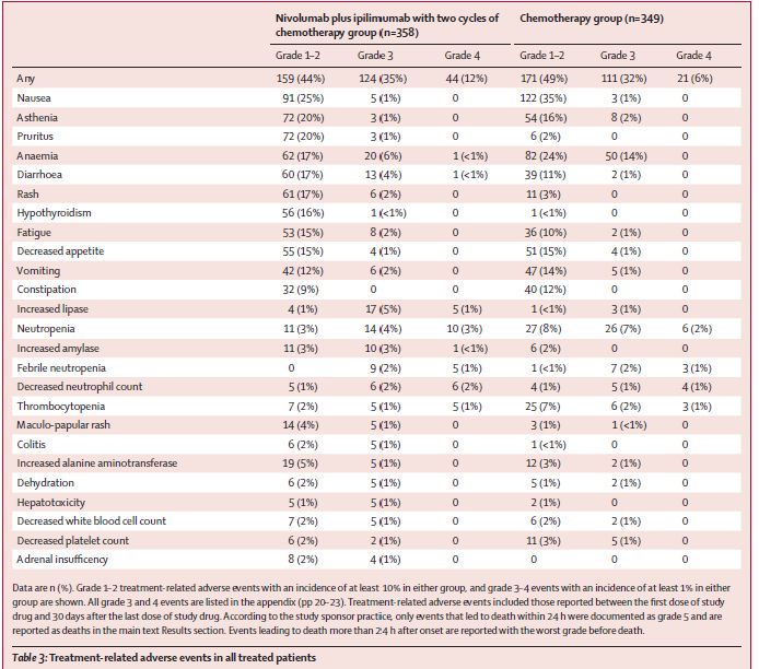
Tables presenting all data are arguably ideal for inclusion in a manuscript, but we often also show them on slides, presenting an overwhelming array of data. If this table is shown for 45 secs, where do your eyes focus?
We can’t convey a message in that time. (2/8)
We can’t convey a message in that time. (2/8)

December 4, 2024 at 11:14 PM
Tables presenting all data are arguably ideal for inclusion in a manuscript, but we often also show them on slides, presenting an overwhelming array of data. If this table is shown for 45 secs, where do your eyes focus?
We can’t convey a message in that time. (2/8)
We can’t convey a message in that time. (2/8)
Tables and Tornadoes: The Best Tools for the Job?
Tables (sometimes BIG) are among most routinely used tools to show data like baseline characteristics & AEs, while “tornado plots” are a standard figure to display AEs & sometimes other variables.
But could we do better, esp for live talks? (1/8)
Tables (sometimes BIG) are among most routinely used tools to show data like baseline characteristics & AEs, while “tornado plots” are a standard figure to display AEs & sometimes other variables.
But could we do better, esp for live talks? (1/8)
December 4, 2024 at 11:14 PM
Tables and Tornadoes: The Best Tools for the Job?
Tables (sometimes BIG) are among most routinely used tools to show data like baseline characteristics & AEs, while “tornado plots” are a standard figure to display AEs & sometimes other variables.
But could we do better, esp for live talks? (1/8)
Tables (sometimes BIG) are among most routinely used tools to show data like baseline characteristics & AEs, while “tornado plots” are a standard figure to display AEs & sometimes other variables.
But could we do better, esp for live talks? (1/8)
Not to say pie charts are never a good choice, but they are suboptimal most of the time.
How can we show results more clearly? A bar graph (here Tan, JCO, 2022) is mundane but more clear. Skoulidis et al (Nat Rev Cancer, 2019) show frequency of comut’ns w/dot plot.
More thoughts later.(7/7)
How can we show results more clearly? A bar graph (here Tan, JCO, 2022) is mundane but more clear. Skoulidis et al (Nat Rev Cancer, 2019) show frequency of comut’ns w/dot plot.
More thoughts later.(7/7)


December 2, 2024 at 11:35 PM
Not to say pie charts are never a good choice, but they are suboptimal most of the time.
How can we show results more clearly? A bar graph (here Tan, JCO, 2022) is mundane but more clear. Skoulidis et al (Nat Rev Cancer, 2019) show frequency of comut’ns w/dot plot.
More thoughts later.(7/7)
How can we show results more clearly? A bar graph (here Tan, JCO, 2022) is mundane but more clear. Skoulidis et al (Nat Rev Cancer, 2019) show frequency of comut’ns w/dot plot.
More thoughts later.(7/7)
A “donut chart” is basically same as pie chart but w/middle carved out to add label or key number; now you don’t have the visual cue of the angle (+ data here have been entered incorrectly, so the figures misrepresent percentages: look at how 1.6% in light purple & orange on R are diff size). (4/7)

December 2, 2024 at 11:35 PM
A “donut chart” is basically same as pie chart but w/middle carved out to add label or key number; now you don’t have the visual cue of the angle (+ data here have been entered incorrectly, so the figures misrepresent percentages: look at how 1.6% in light purple & orange on R are diff size). (4/7)
A 3D graph like the one above & here looks cool, but 3D effect serves to distort the visual display of the data. Due to 3D perspective in this fig, notice how EGFR (12.7%) & KRAS nonG12C groups (23.1%) look ~same, as do BRAF V600E (1.8%) v non-V600E (3.9%). 3D effect adds confusion >> value. (3/7)

December 2, 2024 at 11:35 PM
A 3D graph like the one above & here looks cool, but 3D effect serves to distort the visual display of the data. Due to 3D perspective in this fig, notice how EGFR (12.7%) & KRAS nonG12C groups (23.1%) look ~same, as do BRAF V600E (1.8%) v non-V600E (3.9%). 3D effect adds confusion >> value. (3/7)
Pushing Back on Pie Charts
Though pie charts are a staple of oncology & especially favored for molecular oncology, they have several problems that make them a poor choice for conveying data clearly. I say this knowing that one like the one here was a cornerstone of my presentations for years. (1/7)
Though pie charts are a staple of oncology & especially favored for molecular oncology, they have several problems that make them a poor choice for conveying data clearly. I say this knowing that one like the one here was a cornerstone of my presentations for years. (1/7)

December 2, 2024 at 11:35 PM
Pushing Back on Pie Charts
Though pie charts are a staple of oncology & especially favored for molecular oncology, they have several problems that make them a poor choice for conveying data clearly. I say this knowing that one like the one here was a cornerstone of my presentations for years. (1/7)
Though pie charts are a staple of oncology & especially favored for molecular oncology, they have several problems that make them a poor choice for conveying data clearly. I say this knowing that one like the one here was a cornerstone of my presentations for years. (1/7)
Flew from Shanghai to Seattle to Lake Tahoe yday to attend #MaTOS24 conference today, where Claudia Henschke kicks off on screening.
Great to catch up with so many colleagues, many of whom have been prolific on X but may be thinking about transitioning here. Will try to nudge them along.
Great to catch up with so many colleagues, many of whom have been prolific on X but may be thinking about transitioning here. Will try to nudge them along.

November 22, 2024 at 4:19 PM
Flew from Shanghai to Seattle to Lake Tahoe yday to attend #MaTOS24 conference today, where Claudia Henschke kicks off on screening.
Great to catch up with so many colleagues, many of whom have been prolific on X but may be thinking about transitioning here. Will try to nudge them along.
Great to catch up with so many colleagues, many of whom have been prolific on X but may be thinking about transitioning here. Will try to nudge them along.