


Fonts In Use
@fontsinuse.com
Type at work in the real world. Fonts In Use is an independent archive of typography. https://fontsinuse.com
Primarily on Mastodon: https://typo.social/@fontsinuse
Newsletter: https://newsletter.fontsinuse.com?tag=bluesky
Primarily on Mastodon: https://typo.social/@fontsinuse
Newsletter: https://newsletter.fontsinuse.com?tag=bluesky
It’s Matthew Carter’s typeface, Shelley (fontsinuse.com/typefaces/27...), but like much Word Art it’s been artificially bolded.
But the White House has a Chief Calligrapher (en.wikipedia.org/w/index.php?...), so why not have her do something proper? (Unless she’s been laid off like everyone else.)
But the White House has a Chief Calligrapher (en.wikipedia.org/w/index.php?...), so why not have her do something proper? (Unless she’s been laid off like everyone else.)

November 6, 2025 at 1:59 AM
It’s Matthew Carter’s typeface, Shelley (fontsinuse.com/typefaces/27...), but like much Word Art it’s been artificially bolded.
But the White House has a Chief Calligrapher (en.wikipedia.org/w/index.php?...), so why not have her do something proper? (Unless she’s been laid off like everyone else.)
But the White House has a Chief Calligrapher (en.wikipedia.org/w/index.php?...), so why not have her do something proper? (Unless she’s been laid off like everyone else.)
In 1941, Linotype updated this booklet as “The Readability of Type” and added 1937–1941 to the table.
(This is a reply to an archived post from 2016. We just migrated everything from X using the wonderful @cyd.social and will finally archive our account there.)
(This is a reply to an archived post from 2016. We just migrated everything from X using the wonderful @cyd.social and will finally archive our account there.)

November 2, 2025 at 2:04 AM
In 1941, Linotype updated this booklet as “The Readability of Type” and added 1937–1941 to the table.
(This is a reply to an archived post from 2016. We just migrated everything from X using the wonderful @cyd.social and will finally archive our account there.)
(This is a reply to an archived post from 2016. We just migrated everything from X using the wonderful @cyd.social and will finally archive our account there.)
Not only is David Jonathan Ross one of our longest-running sponsors, he’s now devoting some of his ad space to other type designers whose work he admires – starting with Petra Dočekalová, who just launched her new foundry site, petra-d.com. What a gent!

September 25, 2025 at 6:44 PM
Not only is David Jonathan Ross one of our longest-running sponsors, he’s now devoting some of his ad space to other type designers whose work he admires – starting with Petra Dočekalová, who just launched her new foundry site, petra-d.com. What a gent!
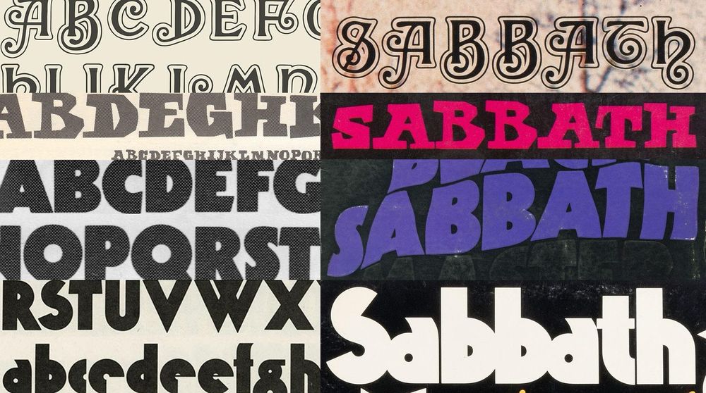
New on the blog: The arcane alphabets of Black Sabbath
To commemorate Ozzy Osbourne, we took a deep dive into the obscure typefaces used on Black Sabbath’s first four album covers.
fontsinuse.com/uses/35835/t...
(Buckle up, it’s a long one.)
To commemorate Ozzy Osbourne, we took a deep dive into the obscure typefaces used on Black Sabbath’s first four album covers.
fontsinuse.com/uses/35835/t...
(Buckle up, it’s a long one.)
July 27, 2025 at 4:14 AM
New on the blog: The arcane alphabets of Black Sabbath
To commemorate Ozzy Osbourne, we took a deep dive into the obscure typefaces used on Black Sabbath’s first four album covers.
fontsinuse.com/uses/35835/t...
(Buckle up, it’s a long one.)
To commemorate Ozzy Osbourne, we took a deep dive into the obscure typefaces used on Black Sabbath’s first four album covers.
fontsinuse.com/uses/35835/t...
(Buckle up, it’s a long one.)
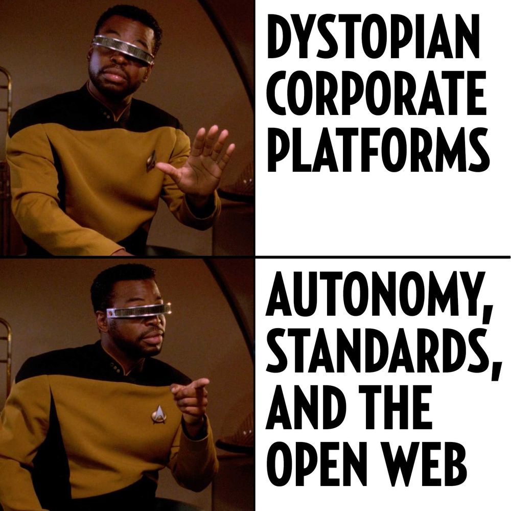
Fonts In Use is not active on Instagram.
We’ve abandoned problematic platforms, embraced ethical alternatives, and survived to talk about it.
More here:
fontsinuse.com/uses/63903/f...
We’ve abandoned problematic platforms, embraced ethical alternatives, and survived to talk about it.
More here:
fontsinuse.com/uses/63903/f...
July 15, 2025 at 5:50 PM
Fonts In Use is not active on Instagram.
We’ve abandoned problematic platforms, embraced ethical alternatives, and survived to talk about it.
More here:
fontsinuse.com/uses/63903/f...
We’ve abandoned problematic platforms, embraced ethical alternatives, and survived to talk about it.
More here:
fontsinuse.com/uses/63903/f...
RIP Bill Atkinson (1951–2025). During his time at Apple, he was central to the development of the graphical user interface of the Lisa and later the Macintosh, and is best known for creating MacPaint, QuickDraw, and HyperCard.
Atkinson also designed Venice, a chancery script bitmap font.
Atkinson also designed Venice, a chancery script bitmap font.

June 8, 2025 at 5:05 PM
RIP Bill Atkinson (1951–2025). During his time at Apple, he was central to the development of the graphical user interface of the Lisa and later the Macintosh, and is best known for creating MacPaint, QuickDraw, and HyperCard.
Atkinson also designed Venice, a chancery script bitmap font.
Atkinson also designed Venice, a chancery script bitmap font.
Congrats to Romie!
The display serif by Margot Lévêque now has one hundred Uses in the #FontsInUse Collection. This makes it the first #typeface exclusively* designed by a woman to join Club 💯!
First released in 2019, Romie was updated a year ago to span six weights in roman and italic.
The display serif by Margot Lévêque now has one hundred Uses in the #FontsInUse Collection. This makes it the first #typeface exclusively* designed by a woman to join Club 💯!
First released in 2019, Romie was updated a year ago to span six weights in roman and italic.

June 4, 2025 at 3:25 PM
Congrats to Romie!
The display serif by Margot Lévêque now has one hundred Uses in the #FontsInUse Collection. This makes it the first #typeface exclusively* designed by a woman to join Club 💯!
First released in 2019, Romie was updated a year ago to span six weights in roman and italic.
The display serif by Margot Lévêque now has one hundred Uses in the #FontsInUse Collection. This makes it the first #typeface exclusively* designed by a woman to join Club 💯!
First released in 2019, Romie was updated a year ago to span six weights in roman and italic.
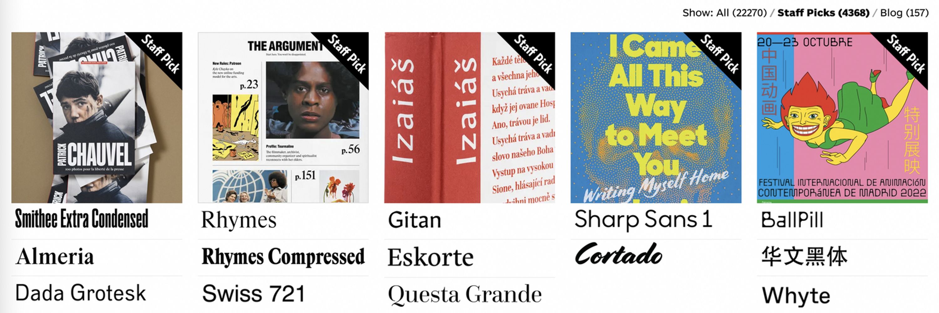
Milestone unlocked: we published the 30,000th Use on fontsinuse.com today!
♥︎ Thanks to all contributors for making this happen, as well as to our sponsors from the type and design community.
#FontsInUse #typography
♥︎ Thanks to all contributors for making this happen, as well as to our sponsors from the type and design community.
#FontsInUse #typography

April 5, 2025 at 4:19 PM
Milestone unlocked: we published the 30,000th Use on fontsinuse.com today!
♥︎ Thanks to all contributors for making this happen, as well as to our sponsors from the type and design community.
#FontsInUse #typography
♥︎ Thanks to all contributors for making this happen, as well as to our sponsors from the type and design community.
#FontsInUse #typography
On Dec 13 we posted the tweet shown in this screenshot. Tonight, that tweet is hidden, replaced with an ad, as part of Musk’s hamfisted/fascistic ban on all Mastodon links. So, we can’t link you to our social network of choice, but you can get there from https://fontsinuse.com.

October 30, 2025 at 4:51 AM
On Dec 13 we posted the tweet shown in this screenshot. Tonight, that tweet is hidden, replaced with an ad, as part of Musk’s hamfisted/fascistic ban on all Mastodon links. So, we can’t link you to our social network of choice, but you can get there from https://fontsinuse.com.
The Fonts In Use team unanimously condemns the assault on safety, security, and basic humanity continually displayed by Twitter’s new ownership. We loved it here, but can no longer justify engaging in this platform. Find us at https://typo.social/@FontsInUse and http://fontsinuse.com.

October 30, 2025 at 4:51 AM
The Fonts In Use team unanimously condemns the assault on safety, security, and basic humanity continually displayed by Twitter’s new ownership. We loved it here, but can no longer justify engaging in this platform. Find us at https://typo.social/@FontsInUse and http://fontsinuse.com.
The only exception is when you encounter embedded content from another site, such as a YouTube video. We present a warning before loading the content so you can choose whether to load that cookie.

October 30, 2025 at 4:51 AM
The only exception is when you encounter embedded content from another site, such as a YouTube video. We present a warning before loading the content so you can choose whether to load that cookie.
Tonight, our co-founder @NickSherman talks Franklin Gothic at @CooperType! http://coopertype.org/event/franklin_gothic_goes_on_forever As a surprise for Nick, we just published a slew of FG in celebration: https://fontsinuse.com/


October 30, 2025 at 4:01 AM
Tonight, our co-founder @NickSherman talks Franklin Gothic at @CooperType! http://coopertype.org/event/franklin_gothic_goes_on_forever As a surprise for Nick, we just published a slew of FG in celebration: https://fontsinuse.com/
“Despite the fact that the practice of deriving Greek letterforms from Latin ones is formally similar in the cases of both Gill and Van Krimpen on one hand and Greek type users on the other, the power dynamics at play and the occasions are in fact very different.”


October 30, 2025 at 4:01 AM
“Despite the fact that the practice of deriving Greek letterforms from Latin ones is formally similar in the cases of both Gill and Van Krimpen on one hand and Greek type users on the other, the power dynamics at play and the occasions are in fact very different.”
Greek type users “had to step into the role of the type designer, repurposing Latin letterforms, modifying them to make them resemble Greek ones, or even creating new glyphs.” That’s how designer Leonidas Christakis assembled the magazine logo from (Latin-only) Letraset Candice.


October 30, 2025 at 4:01 AM
Greek type users “had to step into the role of the type designer, repurposing Latin letterforms, modifying them to make them resemble Greek ones, or even creating new glyphs.” That’s how designer Leonidas Christakis assembled the magazine logo from (Latin-only) Letraset Candice.
♀🇬🇷 New on the Blog: Reclaiming the City, Reclaiming Words
@MPaganopoulou looks back on Πόλη Γυναικών (Póli Gynaikón – City of Women), the Greek feminist periodical from the 1980s:
https://fontsinuse.com/uses/44785/reclaiming-the-city-reclaiming-words
@MPaganopoulou looks back on Πόλη Γυναικών (Póli Gynaikón – City of Women), the Greek feminist periodical from the 1980s:
https://fontsinuse.com/uses/44785/reclaiming-the-city-reclaiming-words

October 30, 2025 at 4:01 AM
♀🇬🇷 New on the Blog: Reclaiming the City, Reclaiming Words
@MPaganopoulou looks back on Πόλη Γυναικών (Póli Gynaikón – City of Women), the Greek feminist periodical from the 1980s:
https://fontsinuse.com/uses/44785/reclaiming-the-city-reclaiming-words
@MPaganopoulou looks back on Πόλη Γυναικών (Póli Gynaikón – City of Women), the Greek feminist periodical from the 1980s:
https://fontsinuse.com/uses/44785/reclaiming-the-city-reclaiming-words
Contributor Patrick Concannon kicks off October 🎃 with a thorough look at the typography of The Exorcist – both of the 1971 novel and the 1973 movie adaptation:
https://fontsinuse.com/tags/34697/the-exorcist
https://fontsinuse.com/tags/34697/the-exorcist


October 30, 2025 at 4:01 AM
Contributor Patrick Concannon kicks off October 🎃 with a thorough look at the typography of The Exorcist – both of the 1971 novel and the 1973 movie adaptation:
https://fontsinuse.com/tags/34697/the-exorcist
https://fontsinuse.com/tags/34697/the-exorcist
The @FontsInUse guessing game:
1. Switch to “Stack” layout mode (top right)
2. Guess the typeface from the thumbnail
3. Hover to reveal the answer https://x.com/w__h_/status/1574537410742194176
1. Switch to “Stack” layout mode (top right)
2. Guess the typeface from the thumbnail
3. Hover to reveal the answer https://x.com/w__h_/status/1574537410742194176
October 30, 2025 at 4:01 AM
The @FontsInUse guessing game:
1. Switch to “Stack” layout mode (top right)
2. Guess the typeface from the thumbnail
3. Hover to reveal the answer https://x.com/w__h_/status/1574537410742194176
1. Switch to “Stack” layout mode (top right)
2. Guess the typeface from the thumbnail
3. Hover to reveal the answer https://x.com/w__h_/status/1574537410742194176
We’re not crying. This book is just really dusty. https://x.com/realdougwilson/status/1573352152223092736

October 30, 2025 at 4:01 AM
We’re not crying. This book is just really dusty. https://x.com/realdougwilson/status/1573352152223092736
https://fontsinuse.com/ is dominated by Latin-script typography. All the more we’re delighted to see more contributions with text using other scripts. Today alone we added projects featuring Cyrillic, Devanagari, Hangul, and Japanese …


October 30, 2025 at 4:01 AM
https://fontsinuse.com/ is dominated by Latin-script typography. All the more we’re delighted to see more contributions with text using other scripts. Today alone we added projects featuring Cyrillic, Devanagari, Hangul, and Japanese …
On the home page today:
Florida for Bergman https://t.co/ILsmFkQznw
↓
Persona for St Augustine https://t.co/aoT2fLaUID
→
Persona by Bergman https://t.co/rfn8pKn0tv https://t.co/zErUDD2Brz
Florida for Bergman https://t.co/ILsmFkQznw
↓
Persona for St Augustine https://t.co/aoT2fLaUID
→
Persona by Bergman https://t.co/rfn8pKn0tv https://t.co/zErUDD2Brz


October 30, 2025 at 4:01 AM
On the home page today:
Florida for Bergman https://t.co/ILsmFkQznw
↓
Persona for St Augustine https://t.co/aoT2fLaUID
→
Persona by Bergman https://t.co/rfn8pKn0tv https://t.co/zErUDD2Brz
Florida for Bergman https://t.co/ILsmFkQznw
↓
Persona for St Augustine https://t.co/aoT2fLaUID
→
Persona by Bergman https://t.co/rfn8pKn0tv https://t.co/zErUDD2Brz
Happy birthday, @PaulMcCartney!
https://fontsinuse.com/search/advanced?v=2&match0=all&tags0=8182,86
https://fontsinuse.com/search/advanced?v=2&match0=all&tags0=8182,86


October 30, 2025 at 4:01 AM
Happy birthday, @PaulMcCartney!
https://fontsinuse.com/search/advanced?v=2&match0=all&tags0=8182,86
https://fontsinuse.com/search/advanced?v=2&match0=all&tags0=8182,86
Last night, Fonts In Use hit the 20,000 Uses milestone. Everyone who contributed work to the site made this possible. Thank you!
We do not have an extensive blog post on the subject but we do have this 20,000 set in Bauhaus Prisma: https://fontsinuse.com/uses/41306/20-000-medical-words
We do not have an extensive blog post on the subject but we do have this 20,000 set in Bauhaus Prisma: https://fontsinuse.com/uses/41306/20-000-medical-words

October 30, 2025 at 4:01 AM
Last night, Fonts In Use hit the 20,000 Uses milestone. Everyone who contributed work to the site made this possible. Thank you!
We do not have an extensive blog post on the subject but we do have this 20,000 set in Bauhaus Prisma: https://fontsinuse.com/uses/41306/20-000-medical-words
We do not have an extensive blog post on the subject but we do have this 20,000 set in Bauhaus Prisma: https://fontsinuse.com/uses/41306/20-000-medical-words
Now rounding things off with a look on Gemma, Nicola Russo’s other typeface design published with Mecanorma. Gemma basically is the missing lowercase of Neo Prisma, with the center gap filled in.
https://fontsinuse.com/typefaces/46678/gemma-mecanorma
https://fontsinuse.com/typefaces/46678/gemma-mecanorma


October 30, 2025 at 4:01 AM
Now rounding things off with a look on Gemma, Nicola Russo’s other typeface design published with Mecanorma. Gemma basically is the missing lowercase of Neo Prisma, with the center gap filled in.
https://fontsinuse.com/typefaces/46678/gemma-mecanorma
https://fontsinuse.com/typefaces/46678/gemma-mecanorma
Happy New Year! We’re kicking off 2022 with a batch of Neo Prisma, a multiline face by Italian designer Nicola Russo, issued as rubdown type by Mecanorma in 1972.
https://fontsinuse.com/typefaces/32798/neo-prisma
https://fontsinuse.com/typefaces/32798/neo-prisma


October 30, 2025 at 4:01 AM
Happy New Year! We’re kicking off 2022 with a batch of Neo Prisma, a multiline face by Italian designer Nicola Russo, issued as rubdown type by Mecanorma in 1972.
https://fontsinuse.com/typefaces/32798/neo-prisma
https://fontsinuse.com/typefaces/32798/neo-prisma
“Fuck War.” set in tightly-spaced Franklin Gothic, followed by a field of lines for signatures. The first two signees are the poster’s designers, Billy Apple and Robert Coburn.
@DesignMuseum #FontSunday #autographs
https://fontsinuse.com/uses/30011/fuck-war-poster
@DesignMuseum #FontSunday #autographs
https://fontsinuse.com/uses/30011/fuck-war-poster

October 30, 2025 at 4:01 AM
“Fuck War.” set in tightly-spaced Franklin Gothic, followed by a field of lines for signatures. The first two signees are the poster’s designers, Billy Apple and Robert Coburn.
@DesignMuseum #FontSunday #autographs
https://fontsinuse.com/uses/30011/fuck-war-poster
@DesignMuseum #FontSunday #autographs
https://fontsinuse.com/uses/30011/fuck-war-poster