


Nick Desbarats
@nickdesb.bsky.social
Independent instructor and best-selling author, data visualization and dashboard design.
Books, videos, articles, training workshops to level up your dataviz or dashboard design chops: www.practicalreporting.com
Books, videos, articles, training workshops to level up your dataviz or dashboard design chops: www.practicalreporting.com
A recent exchange that I had on LinkedIn underscored a humbling but crucial truth: the same chart design can seem clear and obvious to some but genuinely confusing to others, even among smart, well-intentioned people.
Full article: www.practicalreporting.com/blog/2025/9/...
Full article: www.practicalreporting.com/blog/2025/9/...

When creating charts, arrogance is the enemy — Practical Reporting Inc.
tl;dr: A recent exchange that I had on LinkedIn underscored a humbling but crucial truth: the same chart design that seems clear and obvious to some can be genuinely confusing to others, even among...
www.practicalreporting.com
September 23, 2025 at 4:25 PM
A recent exchange that I had on LinkedIn underscored a humbling but crucial truth: the same chart design can seem clear and obvious to some but genuinely confusing to others, even among smart, well-intentioned people.
Full article: www.practicalreporting.com/blog/2025/9/...
Full article: www.practicalreporting.com/blog/2025/9/...
I avoid using radar/spiderweb graphs.
Find out why and what chart types I use instead in my latest post: www.practicalreporting.com/blog/2025/8/...
Find out why and what chart types I use instead in my latest post: www.practicalreporting.com/blog/2025/8/...

Why I avoid using radar/spiderweb graphs (and what I use instead) — Practical Reporting Inc.
I don't use radar graphs because more informative and familiar chart types such as heatmaps and overlapping cycles charts can always communicate the same insights.
www.practicalreporting.com
August 28, 2025 at 4:30 PM
I avoid using radar/spiderweb graphs.
Find out why and what chart types I use instead in my latest post: www.practicalreporting.com/blog/2025/8/...
Find out why and what chart types I use instead in my latest post: www.practicalreporting.com/blog/2025/8/...
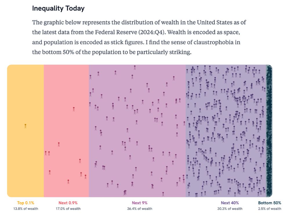
For a while now, I've been trying to think of ways to visually and viscerally communicate just how ludicrous the wealth that the top 1% has accumulated is. This one (not mine) is pretty good...

how the side the on the left keeps convincing the side on the right that they need more space is beyond me
July 11, 2025 at 3:03 PM
For a while now, I've been trying to think of ways to visually and viscerally communicate just how ludicrous the wealth that the top 1% has accumulated is. This one (not mine) is pretty good...
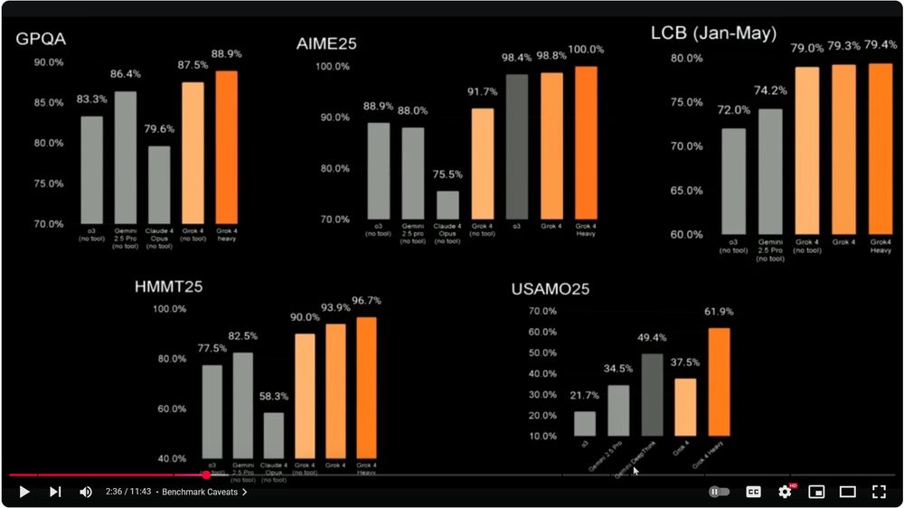
Just heard Musk say that xAI's latest benchmark testing proves that "...Grok 4 is better than PhD-level at everything...".
I guess PhDs don't know that showing bars on truncated scales is a bad idea.
I guess PhDs don't know that showing bars on truncated scales is a bad idea.
July 11, 2025 at 11:53 AM
Just heard Musk say that xAI's latest benchmark testing proves that "...Grok 4 is better than PhD-level at everything...".
I guess PhDs don't know that showing bars on truncated scales is a bad idea.
I guess PhDs don't know that showing bars on truncated scales is a bad idea.
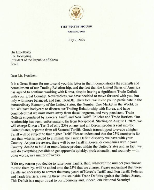
Imagine receiving a letter that threatens your country's entire economy, and that also contains so many grammatical errors and poorly constructed sentences that it would get an F if it were submitted in a high school English writing class. Just... surreal.
July 8, 2025 at 4:35 AM
Imagine receiving a letter that threatens your country's entire economy, and that also contains so many grammatical errors and poorly constructed sentences that it would get an F if it were submitted in a high school English writing class. Just... surreal.
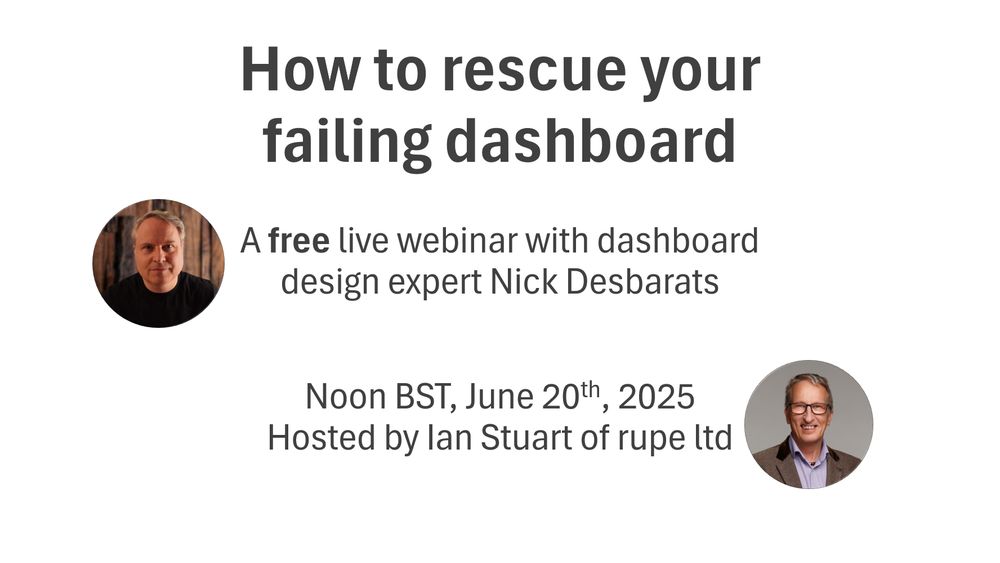
"How to rescue your failing dashboard" webinar recording now available! My 47-minute interview with Ian Stuart of Rupe Ltd covers the top reasons why dashboards die, and what you can do about them.
youtu.be/xL7qHCy-CEE
youtu.be/xL7qHCy-CEE
How to Rescue Your Failing Dashboard - Nick Desbarats interview with Rupe
YouTube video by Practical Reporting Inc.
youtu.be
July 2, 2025 at 1:52 PM
"How to rescue your failing dashboard" webinar recording now available! My 47-minute interview with Ian Stuart of Rupe Ltd covers the top reasons why dashboards die, and what you can do about them.
youtu.be/xL7qHCy-CEE
youtu.be/xL7qHCy-CEE
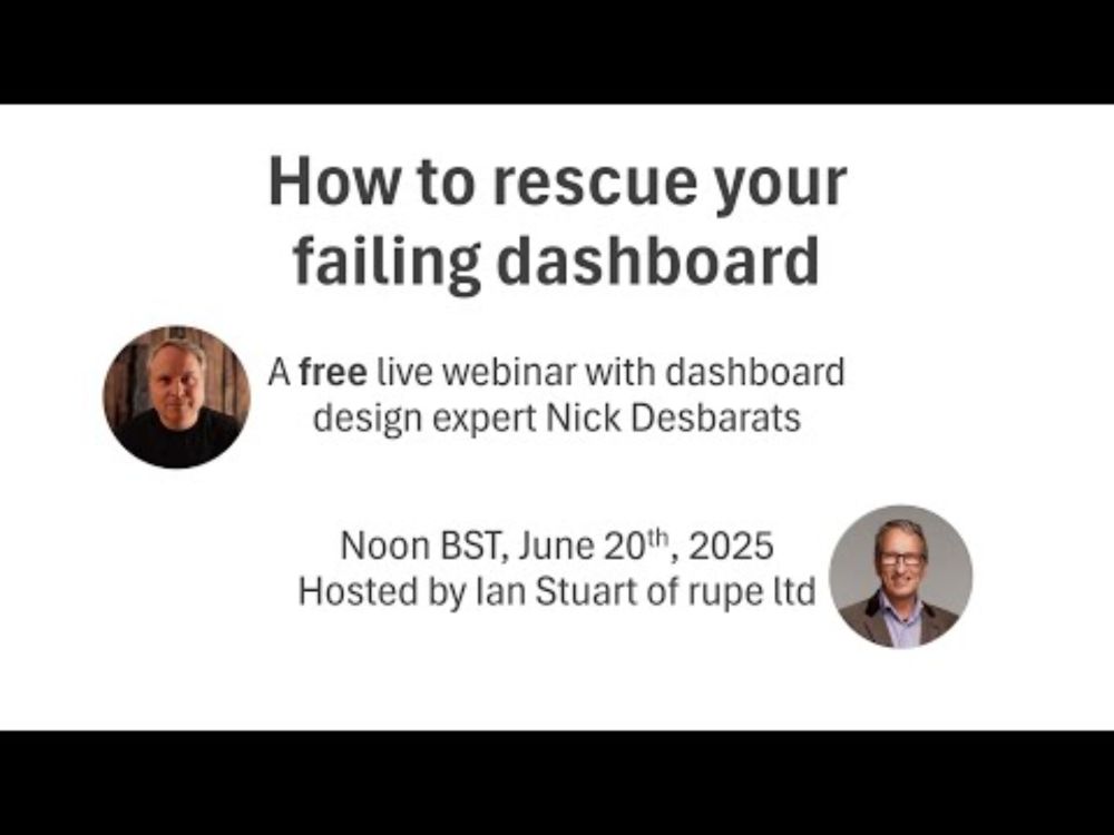
𝗛𝗼𝘄 𝘁𝗼 𝗿𝗲𝘀𝗰𝘂𝗲 𝘆𝗼𝘂𝗿 𝗳𝗮𝗶𝗹𝗶𝗻𝗴 𝗱𝗮𝘀𝗵𝗯𝗼𝗮𝗿𝗱 😬
Unfortunately, many dashboards end up under-used or (worse) abandoned entirely. Why? I'll be covering the top reasons in a FREE webinar at noon BST Jun20. Hope to see you there!
Pre-register for the webinar here: events.teams.microsoft.com/event/4908a1...
Unfortunately, many dashboards end up under-used or (worse) abandoned entirely. Why? I'll be covering the top reasons in a FREE webinar at noon BST Jun20. Hope to see you there!
Pre-register for the webinar here: events.teams.microsoft.com/event/4908a1...
June 10, 2025 at 8:39 PM
𝗛𝗼𝘄 𝘁𝗼 𝗿𝗲𝘀𝗰𝘂𝗲 𝘆𝗼𝘂𝗿 𝗳𝗮𝗶𝗹𝗶𝗻𝗴 𝗱𝗮𝘀𝗵𝗯𝗼𝗮𝗿𝗱 😬
Unfortunately, many dashboards end up under-used or (worse) abandoned entirely. Why? I'll be covering the top reasons in a FREE webinar at noon BST Jun20. Hope to see you there!
Pre-register for the webinar here: events.teams.microsoft.com/event/4908a1...
Unfortunately, many dashboards end up under-used or (worse) abandoned entirely. Why? I'll be covering the top reasons in a FREE webinar at noon BST Jun20. Hope to see you there!
Pre-register for the webinar here: events.teams.microsoft.com/event/4908a1...
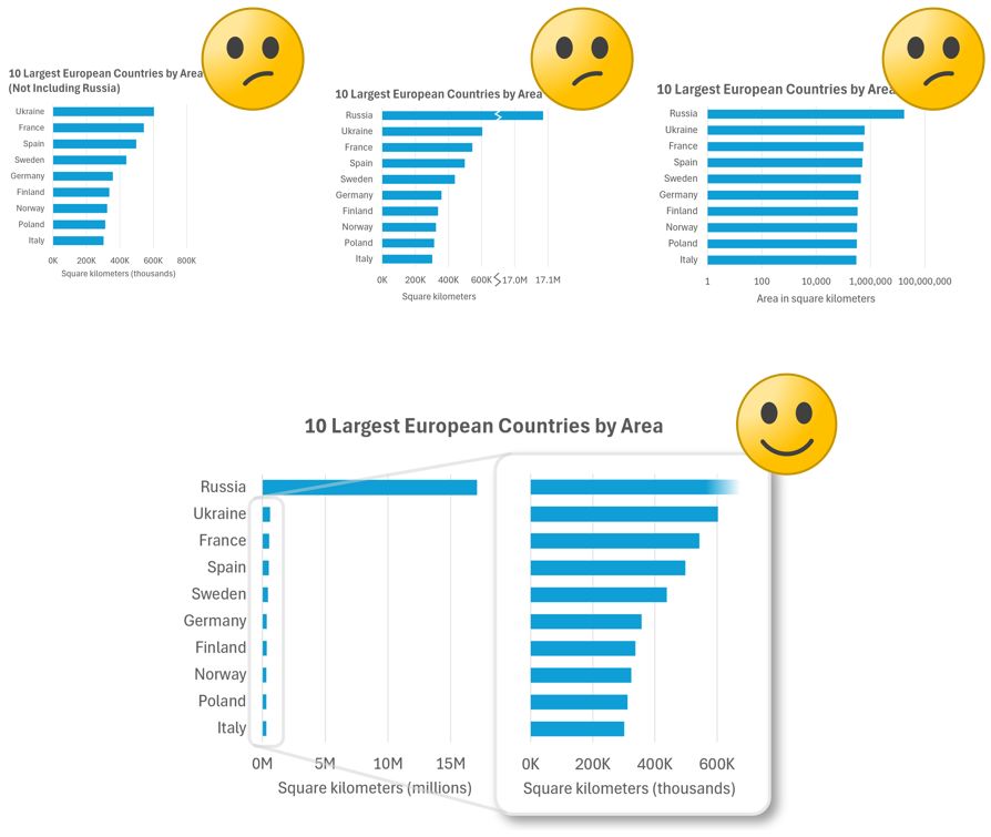
𝗛𝗼𝘄 𝘀𝗵𝗼𝘂𝗹𝗱 𝘆𝗼𝘂 𝘀𝗵𝗼𝘄 𝗢𝗨𝗧𝗟𝗜𝗘𝗥𝗦 𝗶𝗻 𝗰𝗵𝗮𝗿𝘁𝘀?
Check out three common-but-not-ideal methods and one good one (IMHO, anyway) in my latest post: www.linkedin.com/feed/update/...
Check out three common-but-not-ideal methods and one good one (IMHO, anyway) in my latest post: www.linkedin.com/feed/update/...
May 26, 2025 at 7:08 PM
𝗛𝗼𝘄 𝘀𝗵𝗼𝘂𝗹𝗱 𝘆𝗼𝘂 𝘀𝗵𝗼𝘄 𝗢𝗨𝗧𝗟𝗜𝗘𝗥𝗦 𝗶𝗻 𝗰𝗵𝗮𝗿𝘁𝘀?
Check out three common-but-not-ideal methods and one good one (IMHO, anyway) in my latest post: www.linkedin.com/feed/update/...
Check out three common-but-not-ideal methods and one good one (IMHO, anyway) in my latest post: www.linkedin.com/feed/update/...
Inset charts are my favorite #dataviz trick🔥 Many chart creators aren't aware of them but I use them all the time. What are they? Find out in my latest video (5 mins): youtu.be/n1RCV-NMct0
BTW, registration is now open for my Jun2 live online workshop! www.practicalreporting.com/june-2025-on...
BTW, registration is now open for my Jun2 live online workshop! www.practicalreporting.com/june-2025-on...
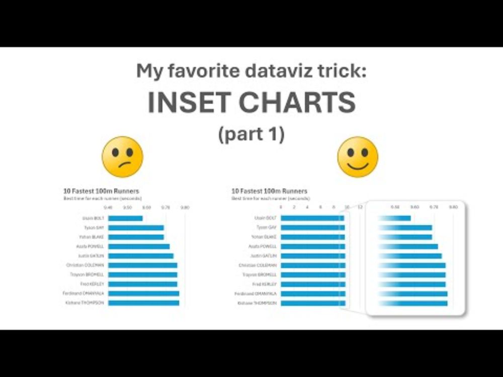
My favorite dataviz trick: inset charts 🔥
YouTube video by Practical Reporting Inc.
youtu.be
May 22, 2025 at 2:08 PM
Inset charts are my favorite #dataviz trick🔥 Many chart creators aren't aware of them but I use them all the time. What are they? Find out in my latest video (5 mins): youtu.be/n1RCV-NMct0
BTW, registration is now open for my Jun2 live online workshop! www.practicalreporting.com/june-2025-on...
BTW, registration is now open for my Jun2 live online workshop! www.practicalreporting.com/june-2025-on...
😱 Don't make these mistakes when showing missing values in your charts! 😱
Are there missing values in your data? Many charts don't show these properly, which can confuse and even mislead readers. How can you avoid this in your charts? Check out my latest post: www.linkedin.com/feed/update/...
Are there missing values in your data? Many charts don't show these properly, which can confuse and even mislead readers. How can you avoid this in your charts? Check out my latest post: www.linkedin.com/feed/update/...

How to show missing values | Nick Desbarats
😱 𝗗𝗼𝗻'𝘁 𝗺𝗮𝗸𝗲 𝘁𝗵𝗲𝘀𝗲 𝗺𝗶𝘀𝘁𝗮𝗸𝗲𝘀 𝘄𝗵𝗲𝗻 𝘀𝗵𝗼𝘄𝗶𝗻𝗴 𝗺𝗶𝘀𝘀𝗶𝗻𝗴 𝘃𝗮𝗹𝘂𝗲𝘀 𝗶𝗻 𝘆𝗼𝘂𝗿 𝗰𝗵𝗮𝗿𝘁𝘀!😱 Are there missing values in your data? Many charts don't show these properly, which can confuse and even mislead readers. How can you avoid this in your charts? Check out the carousel below for tips. BTW, my seven-day "Economic Chaos" Sale ends on Tuesday! 25% off courses, books, and workshops, 𝗶𝗻𝗰𝗹𝘂𝗱𝗶𝗻𝗴 𝗺𝘆 𝘂𝗽𝗰𝗼𝗺𝗶𝗻𝗴 𝗹𝗶𝘃𝗲 𝗼𝗻𝗹𝗶𝗻𝗲 𝘄𝗼𝗿𝗸𝘀𝗵𝗼𝗽 𝗶𝗻 𝗝𝘂𝗻𝗲! Discount codes: https://lnkd.in/erY-2PZM
www.linkedin.com
May 16, 2025 at 12:30 PM
😱 Don't make these mistakes when showing missing values in your charts! 😱
Are there missing values in your data? Many charts don't show these properly, which can confuse and even mislead readers. How can you avoid this in your charts? Check out my latest post: www.linkedin.com/feed/update/...
Are there missing values in your data? Many charts don't show these properly, which can confuse and even mislead readers. How can you avoid this in your charts? Check out my latest post: www.linkedin.com/feed/update/...
Reposted by Nick Desbarats

The discussion and engagement was so good on this over the last few weeks that I went ahead and added 2 whole new sections to this blog post (worth checking out if you already read this!):
I reflect on the discussions and fun that we had as well as provide more resources and a call to action.
I reflect on the discussions and fun that we had as well as provide more resources and a call to action.
May 13, 2025 at 1:50 PM
The discussion and engagement was so good on this over the last few weeks that I went ahead and added 2 whole new sections to this blog post (worth checking out if you already read this!):
I reflect on the discussions and fun that we had as well as provide more resources and a call to action.
I reflect on the discussions and fun that we had as well as provide more resources and a call to action.
"𝗘𝗰𝗼𝗻𝗼𝗺𝗶𝗰 𝗖𝗵𝗮𝗼𝘀" 𝗦𝗮𝗹𝗲 𝗼𝗻 𝗡𝗼𝘄! Until May 20, get 𝟮𝟱% 𝗼𝗳𝗳 on...
👉 Upcoming live online workshop (kicks off June 2)
👉 Practical Charts On Demand (6.5 hrs of video in 45 lessons)
👉 Practical Charts + More Practical Charts books (PDF+eBook editions)
www.practicalreporting.com/blog/2025/5/...
👉 Upcoming live online workshop (kicks off June 2)
👉 Practical Charts On Demand (6.5 hrs of video in 45 lessons)
👉 Practical Charts + More Practical Charts books (PDF+eBook editions)
www.practicalreporting.com/blog/2025/5/...

"Economic Chaos" Sale! 25% off courses and books until May 20th! — Practical Reporting Inc.
I get it. With the unpredictability that's been injected into the global economy, many of us are hesitant to make any kind of new investments, including new upskilling investments. That's why I've de...
www.practicalreporting.com
May 13, 2025 at 4:27 PM
"𝗘𝗰𝗼𝗻𝗼𝗺𝗶𝗰 𝗖𝗵𝗮𝗼𝘀" 𝗦𝗮𝗹𝗲 𝗼𝗻 𝗡𝗼𝘄! Until May 20, get 𝟮𝟱% 𝗼𝗳𝗳 on...
👉 Upcoming live online workshop (kicks off June 2)
👉 Practical Charts On Demand (6.5 hrs of video in 45 lessons)
👉 Practical Charts + More Practical Charts books (PDF+eBook editions)
www.practicalreporting.com/blog/2025/5/...
👉 Upcoming live online workshop (kicks off June 2)
👉 Practical Charts On Demand (6.5 hrs of video in 45 lessons)
👉 Practical Charts + More Practical Charts books (PDF+eBook editions)
www.practicalreporting.com/blog/2025/5/...
▶️ New video (4 mins) ▶️ Should you put key insights in chart titles, on in annotations directly in the chart?
I've recently been leaning toward the latter, but would love to know your opinion in the comments.
www.youtube.com/watch?v=OU3s...
I've recently been leaning toward the latter, but would love to know your opinion in the comments.
www.youtube.com/watch?v=OU3s...
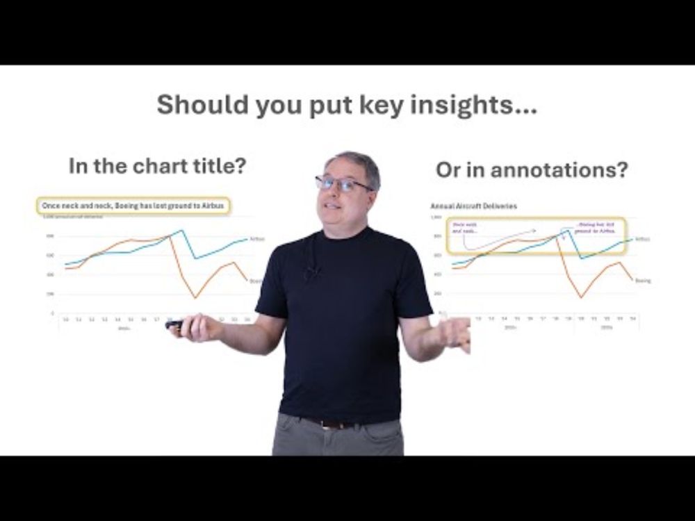
Should you put key insights in chart titles or annotations?
YouTube video by Practical Reporting Inc.
www.youtube.com
May 6, 2025 at 1:00 PM
▶️ New video (4 mins) ▶️ Should you put key insights in chart titles, on in annotations directly in the chart?
I've recently been leaning toward the latter, but would love to know your opinion in the comments.
www.youtube.com/watch?v=OU3s...
I've recently been leaning toward the latter, but would love to know your opinion in the comments.
www.youtube.com/watch?v=OU3s...
▶️New video!▶️Why I don't use colored category labels in my charts (4 mins)
You've probably seen charts where the colors in the chart are identified by coloring category name labels instead of using "traditional" color swatches. I don't use this technique in my charts, though. youtu.be/RLdsgluOqnM
You've probably seen charts where the colors in the chart are identified by coloring category name labels instead of using "traditional" color swatches. I don't use this technique in my charts, though. youtu.be/RLdsgluOqnM
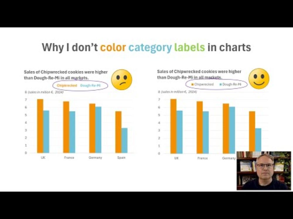
Why I don't color category labels in charts
YouTube video by Practical Reporting Inc.
youtu.be
May 1, 2025 at 11:46 AM
▶️New video!▶️Why I don't use colored category labels in my charts (4 mins)
You've probably seen charts where the colors in the chart are identified by coloring category name labels instead of using "traditional" color swatches. I don't use this technique in my charts, though. youtu.be/RLdsgluOqnM
You've probably seen charts where the colors in the chart are identified by coloring category name labels instead of using "traditional" color swatches. I don't use this technique in my charts, though. youtu.be/RLdsgluOqnM
Reposted by Nick Desbarats
I wrote about the data-to-ink ratio and a new game I've invented called "ink golf" for data visualization.
I hope you enjoy:
www.frank.computer/blog/2025/04...
I hope you enjoy:
www.frank.computer/blog/2025/04...

Minimalism and the absurdity of the data-to-ink-ratio
How much minimalism is too much minimalism? I explore this question and propose the most minimalist, highest scoring data-to-ink ratio on a visualization ever made as a thought piece. Why? Well novice...
www.frank.computer
April 23, 2025 at 2:28 AM
I wrote about the data-to-ink ratio and a new game I've invented called "ink golf" for data visualization.
I hope you enjoy:
www.frank.computer/blog/2025/04...
I hope you enjoy:
www.frank.computer/blog/2025/04...
⏯️New video!⏯️ Watch me redesign a chart so that it "does its job" (10 mins) youtu.be/QnqpuGeKIxw
BTW, live online workshop kicks off on June 2 with early-bird prices ending May 9! Info/registration: www.practicalreporting.com/june-2025-on...
BTW, live online workshop kicks off on June 2 with early-bird prices ending May 9! Info/registration: www.practicalreporting.com/june-2025-on...
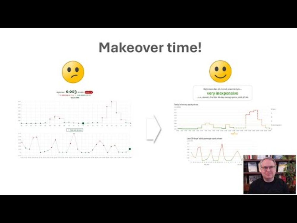
Chart redesign! Watch me make this chart better at "doing its job"!
YouTube video by Practical Reporting Inc.
youtu.be
April 16, 2025 at 3:52 PM
⏯️New video!⏯️ Watch me redesign a chart so that it "does its job" (10 mins) youtu.be/QnqpuGeKIxw
BTW, live online workshop kicks off on June 2 with early-bird prices ending May 9! Info/registration: www.practicalreporting.com/june-2025-on...
BTW, live online workshop kicks off on June 2 with early-bird prices ending May 9! Info/registration: www.practicalreporting.com/june-2025-on...
😱Unpopular opinion warning: 😱 GenAI has made shockingly little progress in the past 24 months when it comes to many/most *real world* tasks: www.linkedin.com/feed/update/...

#dataviz | Nick Desbarats | 15 comments
😱Unpopular opinion warning😱: 𝗔𝗜 𝗵𝗮𝘀 𝗺𝗮𝗱𝗲 𝘀𝗵𝗼𝗰𝗸𝗶𝗻𝗴𝗹𝘆 𝗹𝗶𝘁𝘁𝗹𝗲 𝗽𝗿𝗼𝗴𝗿𝗲𝘀𝘀 𝗶𝗻 𝘁𝗵𝗲 𝗹𝗮𝘀𝘁 𝟮𝟰 𝗺𝗼𝗻𝘁𝗵𝘀 𝘄𝗵𝗲𝗻 𝗶𝘁 𝗰𝗼𝗺𝗲𝘀 𝘁𝗼 𝗺𝗮𝗻𝘆 𝗿𝗲𝗮𝗹-𝘄𝗼𝗿𝗹𝗱 𝘁𝗮𝘀𝗸𝘀.
Yesterday, I posted a video about the strengths and weaknesses of AI ...
www.linkedin.com
April 11, 2025 at 7:43 PM
😱Unpopular opinion warning: 😱 GenAI has made shockingly little progress in the past 24 months when it comes to many/most *real world* tasks: www.linkedin.com/feed/update/...
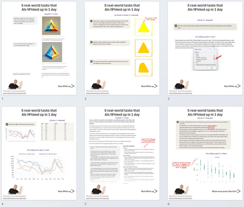
Friendly reminder: LLMs like ChatGPT and Claude still f*$k up SIMPLE tasks all the time.
All the failures in the screenshots below happened in a single day of typical usage for me. Full-res screenshots: www.linkedin.com/feed/update/...
All the failures in the screenshots below happened in a single day of typical usage for me. Full-res screenshots: www.linkedin.com/feed/update/...
April 1, 2025 at 3:40 PM
Friendly reminder: LLMs like ChatGPT and Claude still f*$k up SIMPLE tasks all the time.
All the failures in the screenshots below happened in a single day of typical usage for me. Full-res screenshots: www.linkedin.com/feed/update/...
All the failures in the screenshots below happened in a single day of typical usage for me. Full-res screenshots: www.linkedin.com/feed/update/...
Reposted by Nick Desbarats

I went on X for the first time in months to see if there was still dataviz activity.
I'm happy to report that it's very very low, in quantity and quality. A few cross-posters, too many institutions, and almost none of it gets good engagement.
The discussion has moved away.
I'm relieved.
I'm happy to report that it's very very low, in quantity and quality. A few cross-posters, too many institutions, and almost none of it gets good engagement.
The discussion has moved away.
I'm relieved.
March 22, 2025 at 4:51 PM
I went on X for the first time in months to see if there was still dataviz activity.
I'm happy to report that it's very very low, in quantity and quality. A few cross-posters, too many institutions, and almost none of it gets good engagement.
The discussion has moved away.
I'm relieved.
I'm happy to report that it's very very low, in quantity and quality. A few cross-posters, too many institutions, and almost none of it gets good engagement.
The discussion has moved away.
I'm relieved.
Why it wouldn't make sense for me to adapt my "Practical Charts" course to Power BI's limited visuals (new blog post).
www.practicalreporting.com/blog/2025/3/...
www.practicalreporting.com/blog/2025/3/...

Why it wouldn’t make sense to adapt Practical Charts to Power BI’s limited visuals — Practical Reporting Inc.
My Practical Charts course is tool agnostic, that is, it doesn’t assume that any particular dataviz software product (Excel, Tableau, Google Sheets, etc.) is being used. There are three reasons fo...
www.practicalreporting.com
March 21, 2025 at 2:32 PM
Why it wouldn't make sense for me to adapt my "Practical Charts" course to Power BI's limited visuals (new blog post).
www.practicalreporting.com/blog/2025/3/...
www.practicalreporting.com/blog/2025/3/...
Canadian and thinking of travelling to the US? Read this first.

I’m the Canadian who was detained by Ice for two weeks. It felt like I had been kidnapped

I’m the Canadian who was detained by Ice for two weeks. It felt like I had been kidnapped
I was stuck in a freezing cell without explanation despite eventually having lawyers and media attention. Yet, compared with others, I was lucky
www.theguardian.com
March 19, 2025 at 5:14 PM
Canadian and thinking of travelling to the US? Read this first.
Silver linings, I suppose, but going out of my way to buy Canadian has allowed me to discover that Canadian retailers can be LESS expensive than Amazon. Delivery takes a day or two longer but, personally, I'm fine with that. Buhbye, Jeff.

March 17, 2025 at 4:07 PM
Silver linings, I suppose, but going out of my way to buy Canadian has allowed me to discover that Canadian retailers can be LESS expensive than Amazon. Delivery takes a day or two longer but, personally, I'm fine with that. Buhbye, Jeff.
Reposted by Nick Desbarats

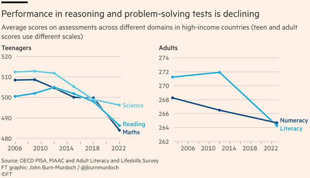
NEW 🧵 Is human intelligence starting to decline?
Recent results from major international tests show that the average person’s capacity to process information, use reasoning and solve novel problems has been falling since around the mid 2010s
What should we make of this?
www.ft.com/content/a801...
Recent results from major international tests show that the average person’s capacity to process information, use reasoning and solve novel problems has been falling since around the mid 2010s
What should we make of this?
www.ft.com/content/a801...
March 14, 2025 at 1:18 PM
NEW 🧵 Is human intelligence starting to decline?
Recent results from major international tests show that the average person’s capacity to process information, use reasoning and solve novel problems has been falling since around the mid 2010s
What should we make of this?
www.ft.com/content/a801...
Recent results from major international tests show that the average person’s capacity to process information, use reasoning and solve novel problems has been falling since around the mid 2010s
What should we make of this?
www.ft.com/content/a801...
▶️ 𝗡𝗲𝘄 𝘃𝗶𝗱𝗲𝗼 ▶️ When should you use a table instead of a graph? (10 mins.)
BTW, 🇪🇺 European friends! 🇪🇺 I'll be your continent of the woods in May. Interested in a private in-person workshop for your team? DM me!
youtu.be/TeZx7yMRmy0
BTW, 🇪🇺 European friends! 🇪🇺 I'll be your continent of the woods in May. Interested in a private in-person workshop for your team? DM me!
youtu.be/TeZx7yMRmy0

When to use a table vs. a graph
YouTube video by Practical Reporting Inc.
youtu.be
March 3, 2025 at 4:53 PM
▶️ 𝗡𝗲𝘄 𝘃𝗶𝗱𝗲𝗼 ▶️ When should you use a table instead of a graph? (10 mins.)
BTW, 🇪🇺 European friends! 🇪🇺 I'll be your continent of the woods in May. Interested in a private in-person workshop for your team? DM me!
youtu.be/TeZx7yMRmy0
BTW, 🇪🇺 European friends! 🇪🇺 I'll be your continent of the woods in May. Interested in a private in-person workshop for your team? DM me!
youtu.be/TeZx7yMRmy0
Reposted by Nick Desbarats

From Opinion
“Politicians are allowed to criticize the press,” writes the editorial board. “But there is a difference between using language and using muscle.” The Trump administration “is mustering the arms of government to suppress speech it doesn’t like and compel words and ideas it prefers.”
“Politicians are allowed to criticize the press,” writes the editorial board. “But there is a difference between using language and using muscle.” The Trump administration “is mustering the arms of government to suppress speech it doesn’t like and compel words and ideas it prefers.”

Opinion | The MAGA War on Speech
If only the powerful are free to speak their minds, it’s not free speech.
www.nytimes.com
February 28, 2025 at 3:24 PM
From Opinion
“Politicians are allowed to criticize the press,” writes the editorial board. “But there is a difference between using language and using muscle.” The Trump administration “is mustering the arms of government to suppress speech it doesn’t like and compel words and ideas it prefers.”
“Politicians are allowed to criticize the press,” writes the editorial board. “But there is a difference between using language and using muscle.” The Trump administration “is mustering the arms of government to suppress speech it doesn’t like and compel words and ideas it prefers.”