Koen Van den Eeckhout
@vandeneeckhoutkoen.bsky.social
1.7K followers 170 following 370 posts
📊 Turning complex data into powerful visual stories! Author of 'Powerful Charts'. Ex-physicist. He/him 🏳️‍🌈
Posts Media Videos Starter Packs
Pinned
vandeneeckhoutkoen.bsky.social
Hey all!

With a large inflow of new followers across multiple platforms, it might be a good idea to re-introduce myself.

I'm a freelance information designer from Belgium, often operating under the alias 'Baryon Design'.

(1/4)
A photograph of Koen Van den Eeckhout, smiling and wearing a dark red sweater, in front of the Ghent public library.
vandeneeckhoutkoen.bsky.social
The Nobel Prize exists since 1901. In those 125 years, the Prize was awarded 927 times to a man, but only 68 times to a woman. 2009 was a record year, with 5 women winning the Prize.

4/4
Infographic titled “Women of the Nobel Prize”, designed by Koen Van den Eeckhout. The top text explains that since 1901, the Nobel Prize has been awarded 927 times to men and 68 times to women, noting that 2009 was a record year with five female laureates. It also highlights the 2025 winners: Mary E. Brunkow, awarded the Nobel Prize in Medicine for discovering peripheral immune tolerance, and Maria Corina Machado, awarded the Peace Prize for promoting democratic rights in Venezuela.

Below the text, a vertical bar chart shows the number of male (beige bars) and female (pink bars) Nobel laureates per year from 1901 to 2025. Male laureates are represented by bars extending downward, and female laureates by bars extending upward. The timeline begins at 1901 on the left and ends at 2025 on the right, where a legend indicates 2 women and 12 men for that year.
vandeneeckhoutkoen.bsky.social
Maria Corina Machado wins the Peace Prize for promoting democratic rights for the people of Venezuela.

3/4
Infographic titled “Women of the Nobel Prize – Peace”, designed by Koen Van den Eeckhout. It displays Nobel Peace Prize winners from 1901 to 2025 as a horizontal sequence of small bars — beige for male laureates, pink for female laureates, and blue for organizations. The vertical timeline runs from 1901 on the left to 2025 on the right.

Two black-and-white portraits highlight women laureates: Bertha von Suttner (1905, prize share 1/1) on the left, and Maria Corina Machado (2025, prize share 1/1) on the right.

Below the timeline, the text reads:
Peace — 92 men, 31 organisations, 20 women (14.0%)
vandeneeckhoutkoen.bsky.social
Mary E. Brunkow wins the Nobel Prize in Medicine for her discovery of peripheral immune tolerance, together with Frederick J. Ramsdell and Shimon Sakaguchi. They each receive 1/3rd of the award.

2/4
Infographic titled “Women of the Nobel Prize – Medicine”, designed by Koen Van den Eeckhout. It shows all Nobel Prizes in Medicine from 1901 to 2025 as a horizontal sequence of small bars — beige for male laureates and pink for female laureates. The timeline runs vertically labeled from 1901 on the left to 2025 on the right.

A black-and-white portrait of Gerty Cori appears above 1947, labeled “1947 Gerty Cori, prize share: 1/4.” On the far right, Mary E. Brunkow is shown with “2025 Mary E. Brunkow, prize share: 1/3.”

Below the timeline, the text reads:
Medicine — 218 men, 14 women (6.0%)
vandeneeckhoutkoen.bsky.social
Now that all the Nobel laureates for 2025 are known, it's time to update my 'Women of the Nobel Prize' visual!

This year, 2 women received the Prize.

1/4

#nobelprize #infographic
vandeneeckhoutkoen.bsky.social
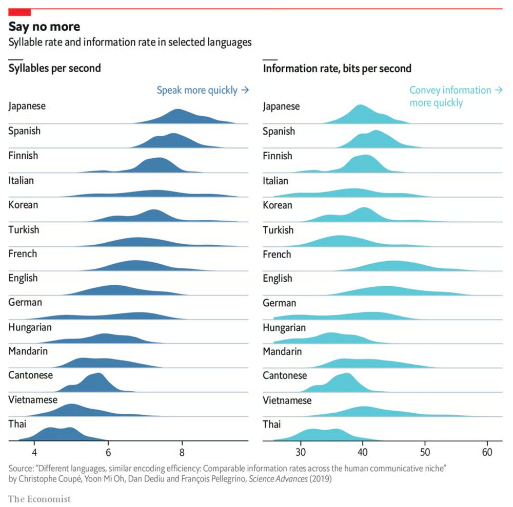
A personal favorite of mine is this overview of languages, indicating how different languages have wildly different speaking rates (syllables per second), but roughly the same information rate (bits per second):
www.economist.com/graphic-deta...

2/2
Why are some languages spoken faster than others?
New research suggests that different tongues, regardless of speed, transmit information at roughly the same rate
www.economist.com
vandeneeckhoutkoen.bsky.social
Some languages are spoken faster, but most languages have similar information rates.

When it comes to insightful data visuals, The Economist is a source of inspiration you shouldn't miss. Their 'Graphic Detail' section is a goldmine of charts:
www.economist.com/topics/graph...

1/2
Set of density plots by the Economist, titled 'Say no more: syllable rate and information rate in selected languages'. The left side of the chart shows syllables per second for different languages, with Japanese, Spanish and Finnish near the top, and Cantonese, Vietnamese and Thai at the bottom. On the right, the information rate is shown in bits per second, with nearly every language distributed around a similar average value of roughly 40 bits per second.
vandeneeckhoutkoen.bsky.social
Currently diving into this, so expect some more in-depth explorations and examples in the upcoming weeks. Make sure to connect/follow if you want to come along for the ride 😉

7/7
vandeneeckhoutkoen.bsky.social
➡️ Different audiences and tasks require different levels of uncertainty information. A technical user may want full probability distributions; a lay audience might only need a rough idea of the error range.

6/7
vandeneeckhoutkoen.bsky.social
➡️ The design challenge is: we need extra visual variables to show uncertainty, but often we have already crowded the visual design (color, position, size, shape). Finding effective, intuitive encodings is crucial. Often this will be transparency, brightness, or fuzziness.

5/7
vandeneeckhoutkoen.bsky.social
➡️ There is a distinction in the origin of the uncertainty: uncertainty in the data (e.g. sampling, measurement errors) vs uncertainty created during the visualization process (e.g. what gets lost in aggregation or interpolation).

4/7
vandeneeckhoutkoen.bsky.social
➡️ But representing uncertainty is hard, especially to non-expert audiences. Data visuals that look “precise” tend to mislead into overconfidence.

3/7
vandeneeckhoutkoen.bsky.social
➡️ Almost every dataset (especially forecasts, measurements, sampling, surveys) has uncertainty: measurement errors, sampling variability, assumptions, missing data, etc. Ignoring this uncertainty will overstates the confidence in results.

2/7
vandeneeckhoutkoen.bsky.social
I've been thinking a lot about visualizing uncertainty in #dataviz lately. Here are some of my current thoughts:

1/7
vandeneeckhoutkoen.bsky.social
🔑 Vector images: your new best friend. To get something out of your head and onto your page, you need the flexible editing offered by vector shapes.

In my #infographics workshops we tackle each of these one by one, to give your next design that extra 'pro' touch!

3/3
vandeneeckhoutkoen.bsky.social
🔑 Consistency: it's all in the details - make sure your fonts, colors and illustration style are hyper consistent throughout the #infographic. Every tiny detail counts!

2/3
vandeneeckhoutkoen.bsky.social
Why do some infographics feel very professional, while yours feels amateurish?

There are 3 essential keys you might be missing:

🔑 Sketching: never start creating an infographic without working on paper first. Sketch ideas, explore layouts, iterate!

1/3
vandeneeckhoutkoen.bsky.social
Thanks for reading until the very end! I'm an information designer with a background in physics, and love sharing tools and techniques to create powerful charts. Feel free to follow me, or read more at baryon.be !

15/15
vandeneeckhoutkoen.bsky.social
Note: visuals taken from Elia’s ‘Adequacy and flexibility study for Belgium, 2026–2036’, which you can access at www.elia.be/en/electrici...

14/15
vandeneeckhoutkoen.bsky.social
Of course, that’s something not every #dataviz tool will allow, so that’s only for when you’re willing to make some final custom modifications for your report.

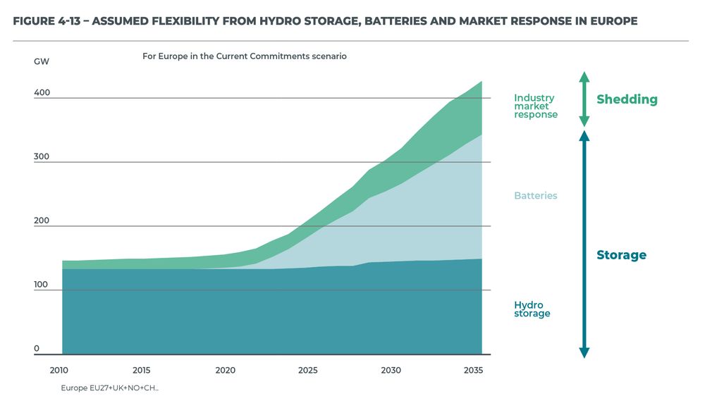
Here’s the full comparison between our original visual, and the reworked chart.

13/15
vandeneeckhoutkoen.bsky.social
Finally, a small bonus tip. If you’re tight on space, you don’t have to make your gridlines go all the way from left to right. You could consider only adding them when they’re needed. That would give you some extra whitespace to fit, for example, your title and subtitle:

12/15
vandeneeckhoutkoen.bsky.social
Some final cleanup stuff:
- align the subtitle and note, move the GW label
- add ticks to the horizontal axis as well
- optimize the annotation to the right, brackets make more sense here than arrows
- add explicit data values for 2035 to further increase precision

11/15
vandeneeckhoutkoen.bsky.social
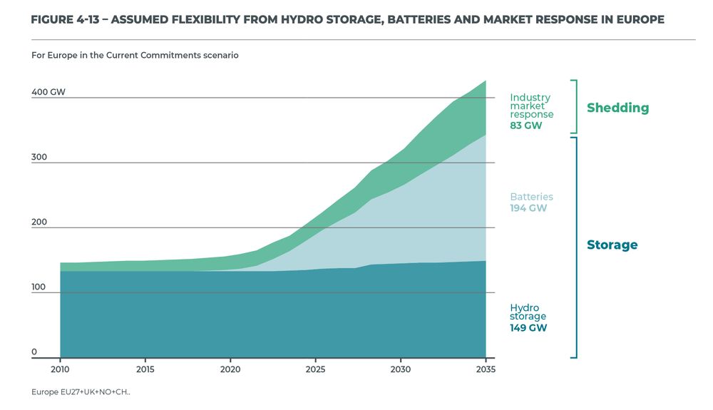
I’ve made the colored areas a bit transparent, so you can still see the gridlines clearly. Notice how you can easily see that the total value is growing to 200 GW by 2025, and reaching 300 GW by 2030. These intermediate values were hard to read in the original visual!

10/15
vandeneeckhoutkoen.bsky.social
✅ more precision if you’re trying to estimate data values
✅ this precision boost impacts all parts of the visual: left, middle, and right

Here’s how that looks like for our visual.

9/15
vandeneeckhoutkoen.bsky.social
I’m probably just nitpicking, but that doesn’t look so great to me! In these situations, I will always prefer to switch to gridlines. Yes, they take up more space and create more ‘stuff’ in the visual, but they have two major benefits.

8/15
vandeneeckhoutkoen.bsky.social
This is a clean, strong visual thanks to the use of direct labels and some helpful annotations. The only thing I don’t like is that vertical axis sticking out like a sore thumb at the left side. However, the labels and annotations are in the way when we want to move it.

7/15